
I’ve been at Meteor Group for a little over a month, but they already want new branding. Their old logo isn’t bad, just a little dated. It’s shown below.
![]()
Our COO wanted the new identity to include an icon or symbol because we are essentially a mobile company. I presented about 15 comps. I usually like to stick with black and white for an initial presentation, but I had to show a little color to get them excited and convey the idea. The eight below got the most consideration.

But it didn’t take long for our owner to pick number 2. Before I refined his pick, I wanted to apply the logo as is in some context that we were actually doing to use it. That way, I could get an idea of how I needed to enhance or tweak it. So, I mocked up a quick letterhead and business card.

There were a few problems with the initial sketch of #2 that were evident when applied to the letterhead and business card. It was perhaps too flat. And, the flame wasn’t defined enough. After a little depth and refinement, the final logo was set. Its is shown below on a black and white background.
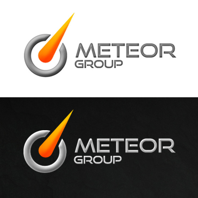
Everyone is happy with the logo, but its not perfect. The color gray has to change slightly depending on whether it is applied to a dark or light background. I always prefer to design a one logo that works in every situation. The logo is applied to the Meteor Group site below.

The owner of Meteor Group does prefer the logo on a dark background and I do agree that it pops more on the black background of the website. You can find more branding examples for the website here.
What are your thoughts on the new Meteor Group logo redesign and branding?