
Bandwagon Technologies approached me about creating a logo identity for a new bar trivia app.
They had two target stakeholders:
- Casual Mobile Game Players (M/F, ages 21-45, socially minded, enjoys a deal/coupon)
- Bar and Restaurant Owners (millennial-minded, forward thinking, engaged with their business/willing to try new things)
Bandwagon listed the values that were important for the identity to reflect:
Recognition: Based on the idea that people play pub trivia for the chance to be personally recognized for their knowledge, we have a unique reward system that secretly catalogs your quirky knowledge and doles out fun badges you can collect and show off. As you play through the game in a broad category like “sports,” we’ll catalog that you know a lot about hockey, or the Stanley Cup and upon finishing you’ll see that you’ve won points, coins, and a badge called “Slapshot” telling you that you’ve answered XX hockey questions.
Humor: Based on the idea that competition brings people together in a lighthearted camaraderie, we want to make space for humor and laughter in our game, and our company.
Connection: Being on your phone in a bar is a barrier to connecting to those around you and is changing that social space. By leveraging millennial gaming trends to drive solo players into social space and encourage connection of people in bars , we’re fostering that social shift in a way that’s positive for people and businesses. It will not be an obvious function of the next version of the game but a goal is to add mechanics that create teams and reward live social interaction.
Goals / Placements:
Example: Yelp Brand Identity
This logo will be used across a variety of platforms in many different ways.
- It will sit on a web-based dashboard used by bar owners to drive revenue and analyze guest performance data.
- It will encourage views and downloads in iOS and Google Play
- It will encourage play on the mobile phone screen (on-deck)
- As a small cling on a bar door or window to let players know there are player rewards in this location
- On corporate presentations for funding and promotion.
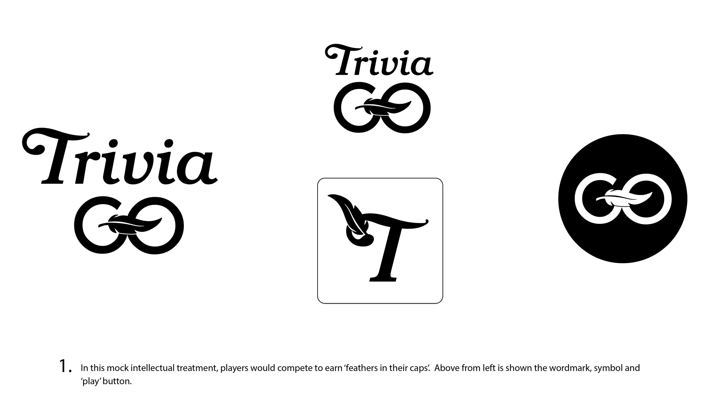
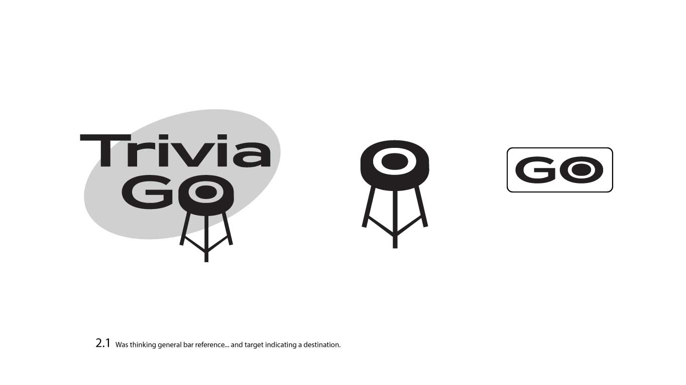
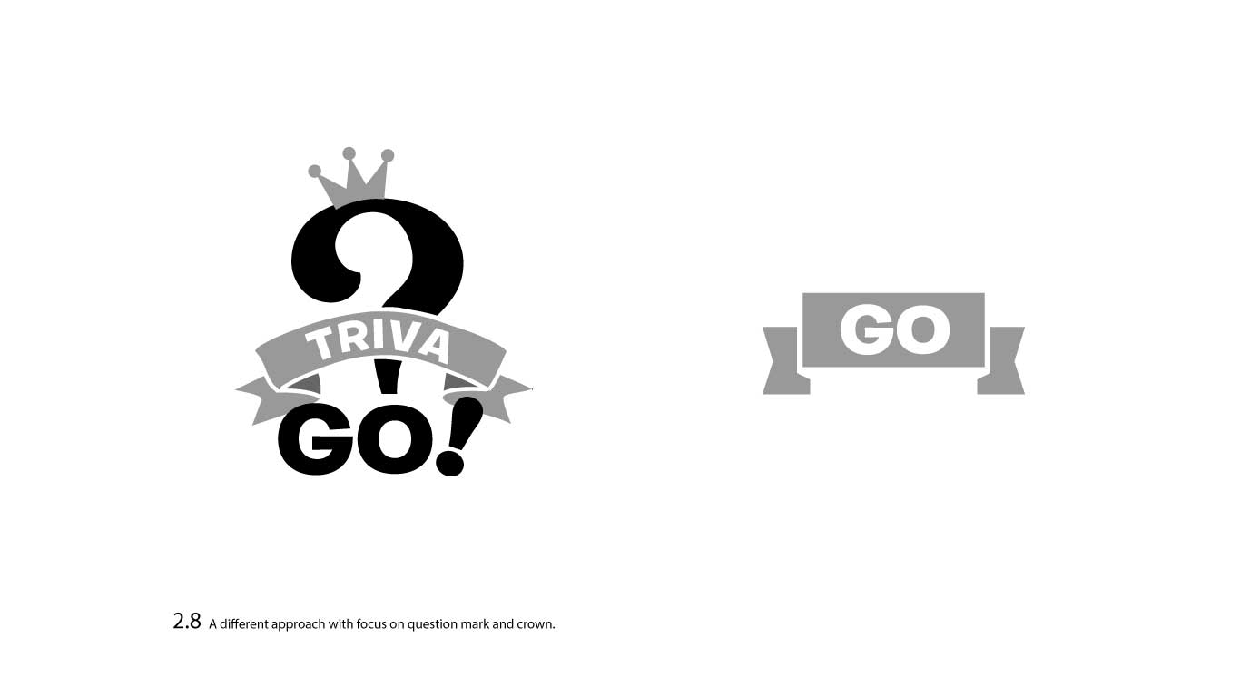
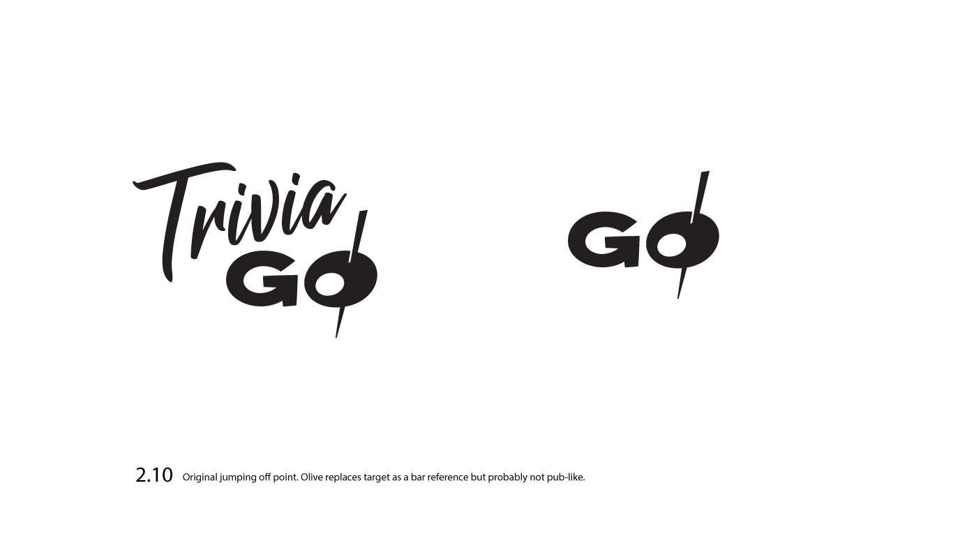
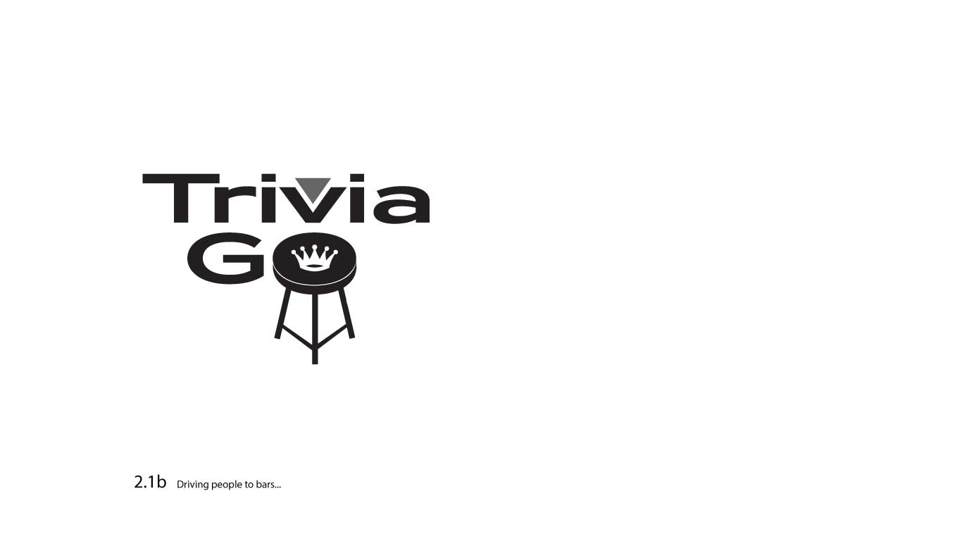
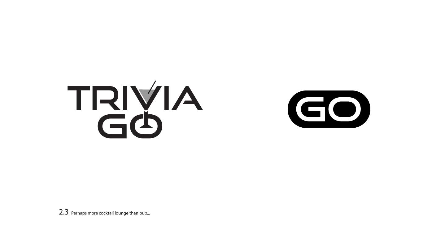
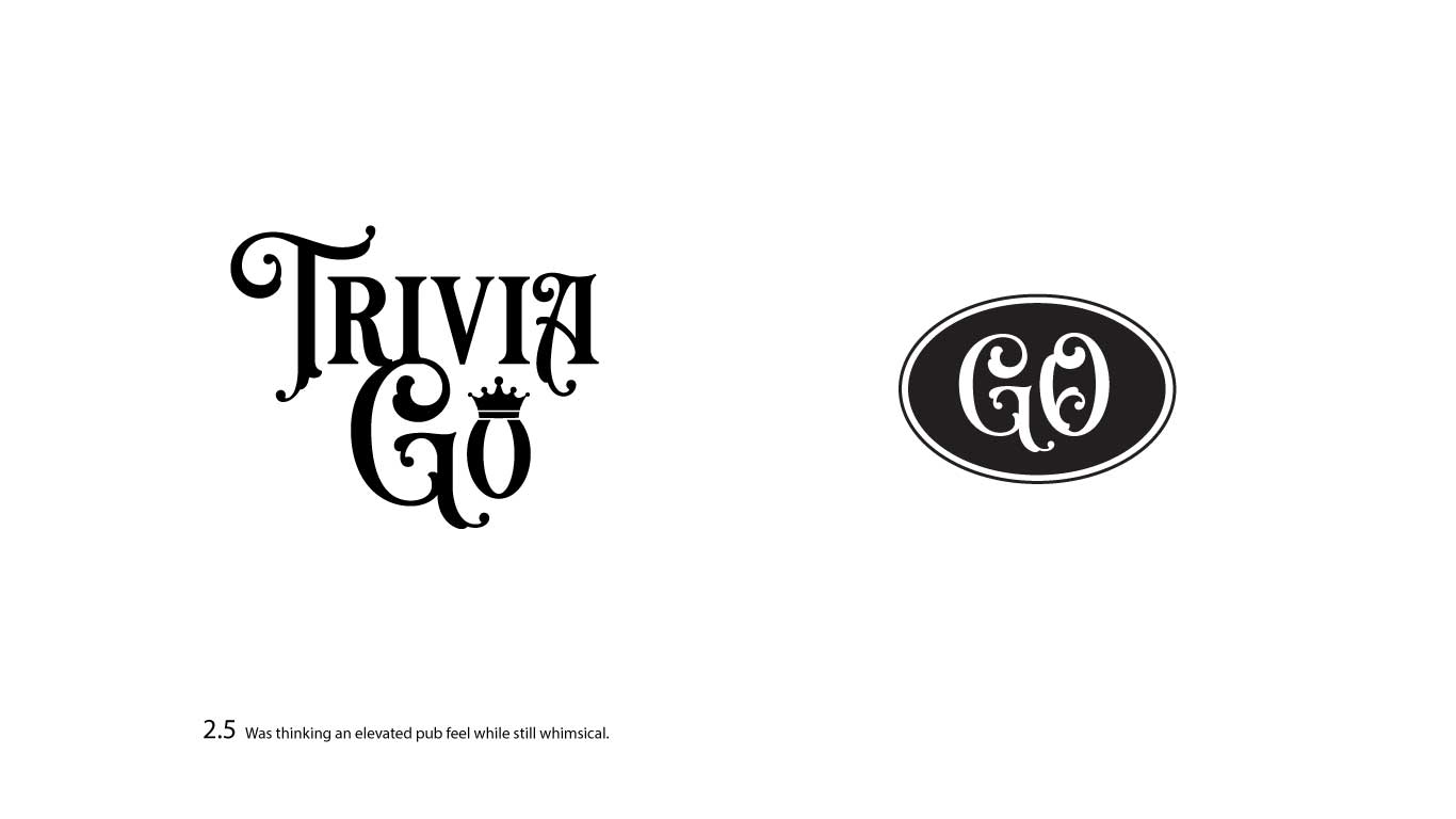
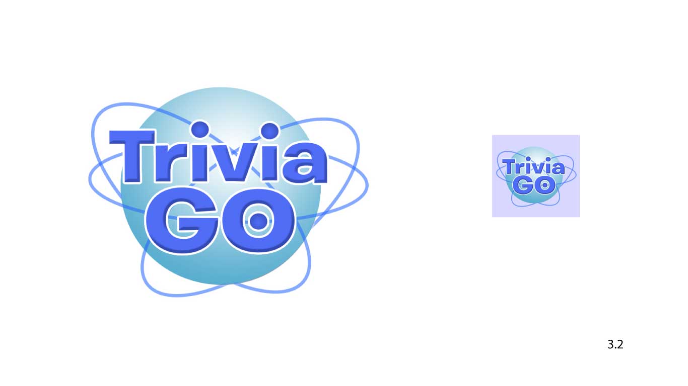
I started very broadly and in black and white.
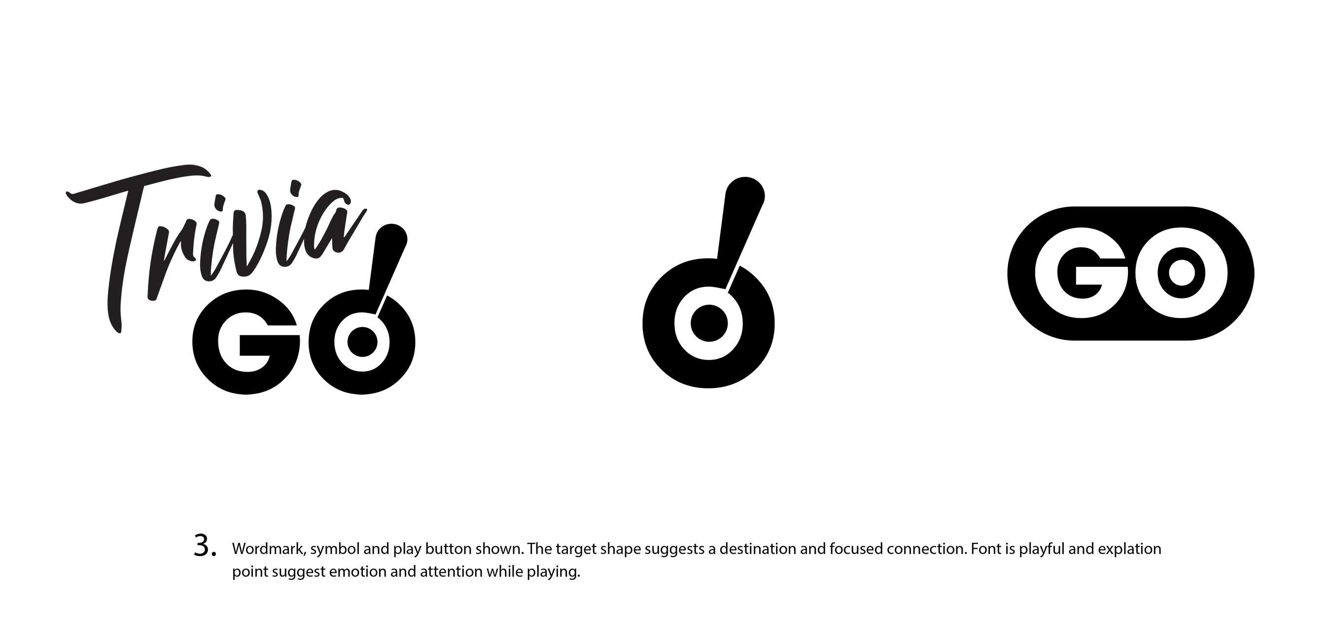
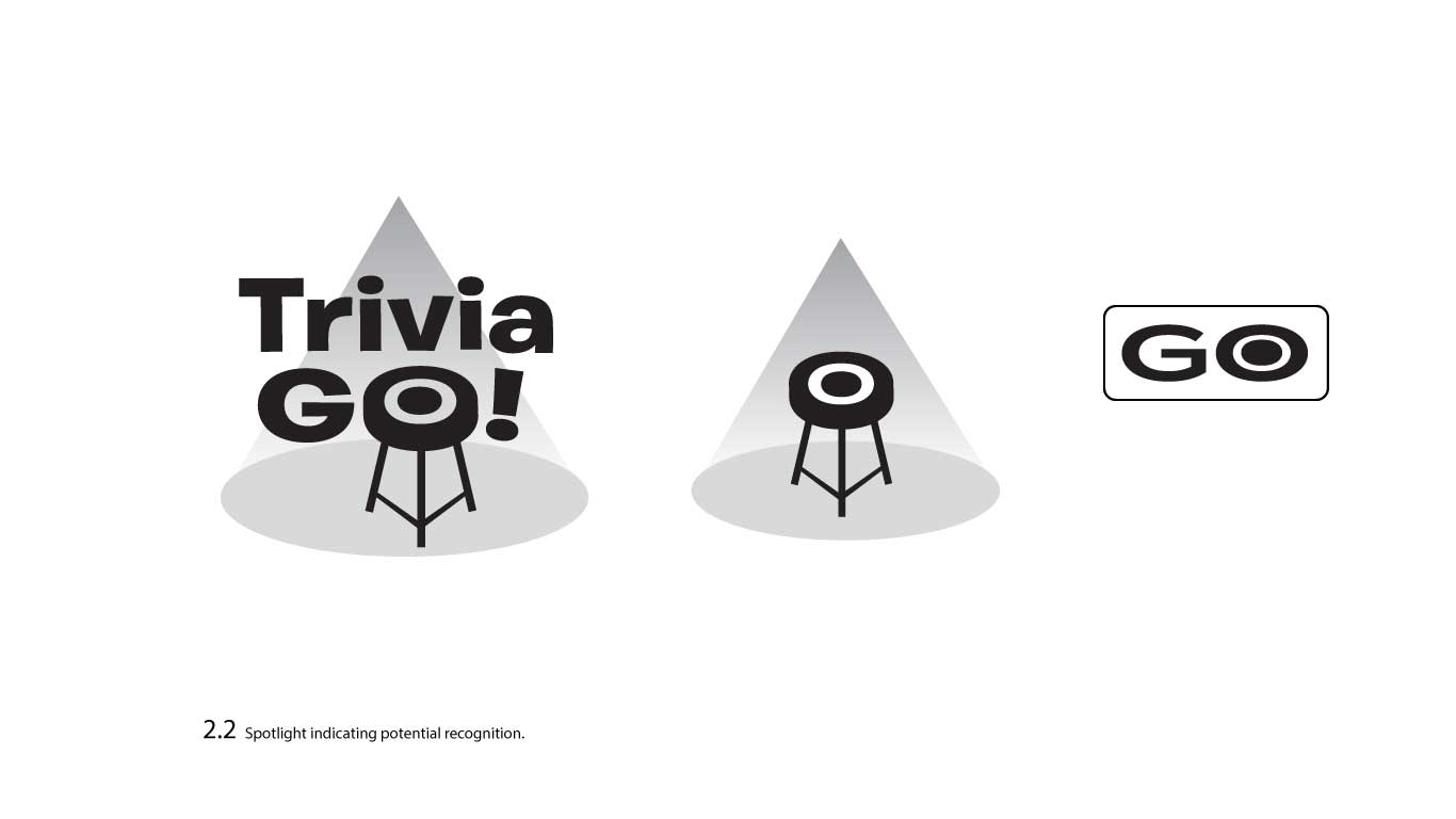
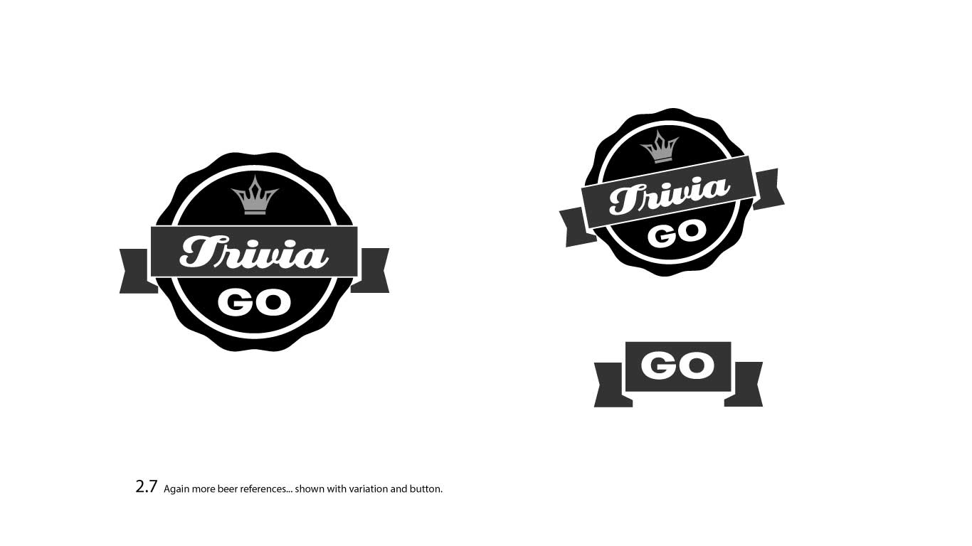
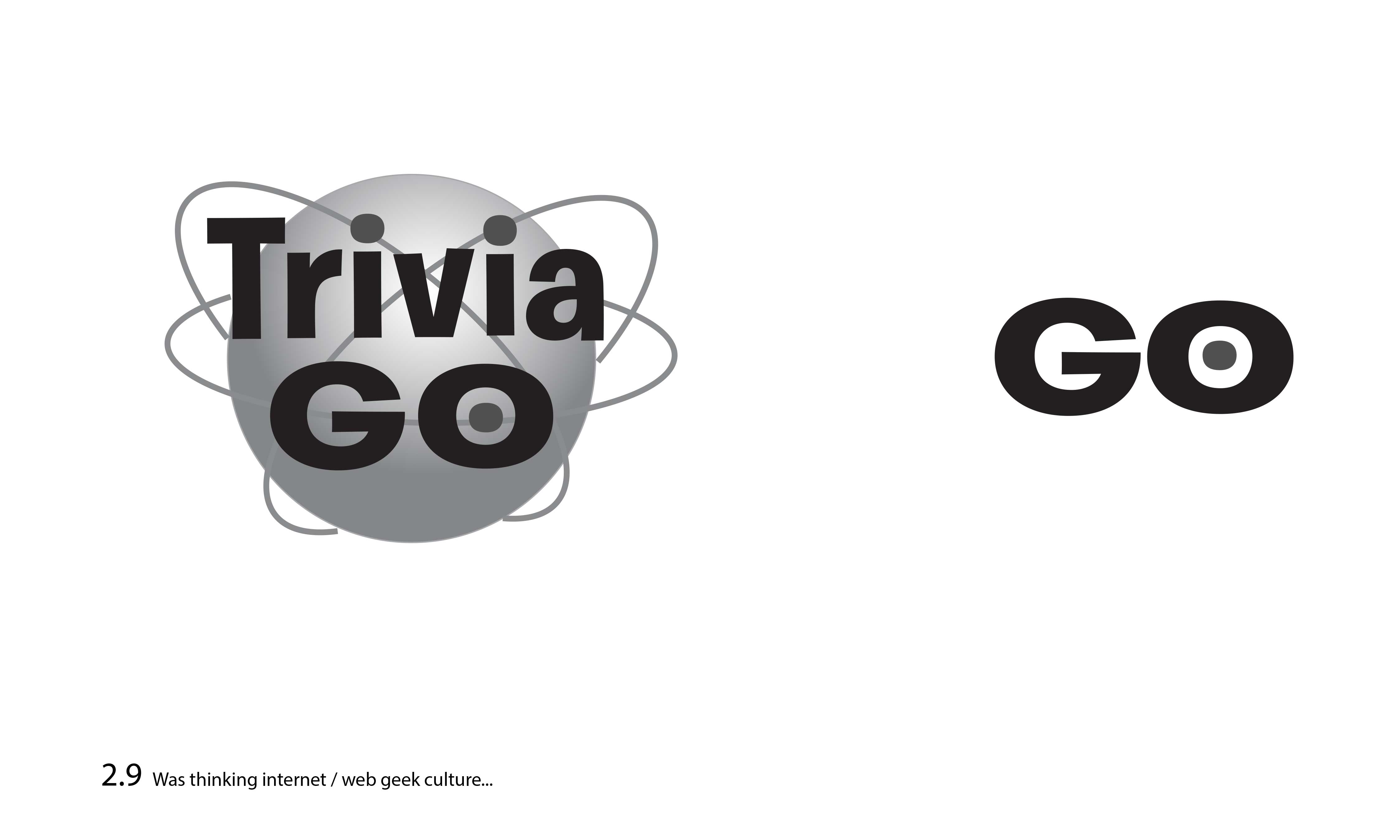
After client feedback, I had more of an idea of what they were looking for, so for Round 2, I designed more but tighter logos, still in B&W.
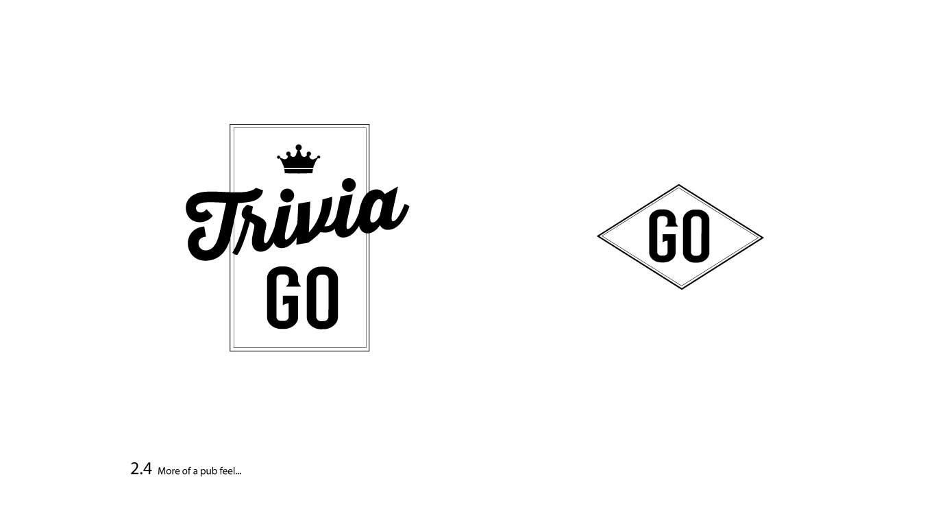
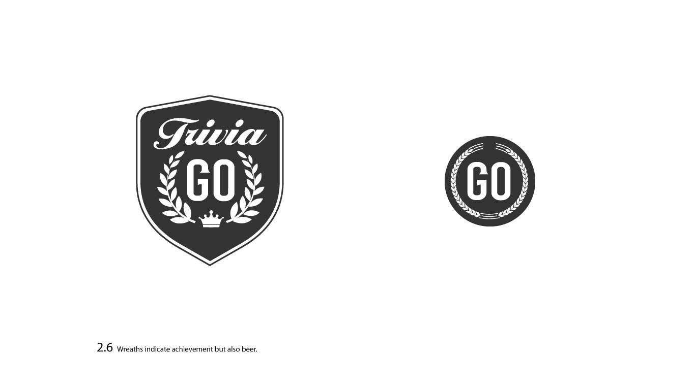
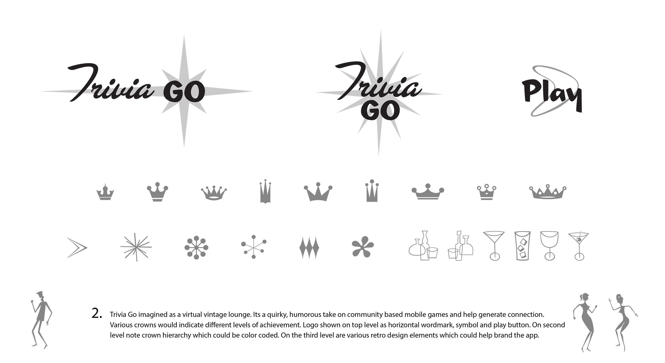
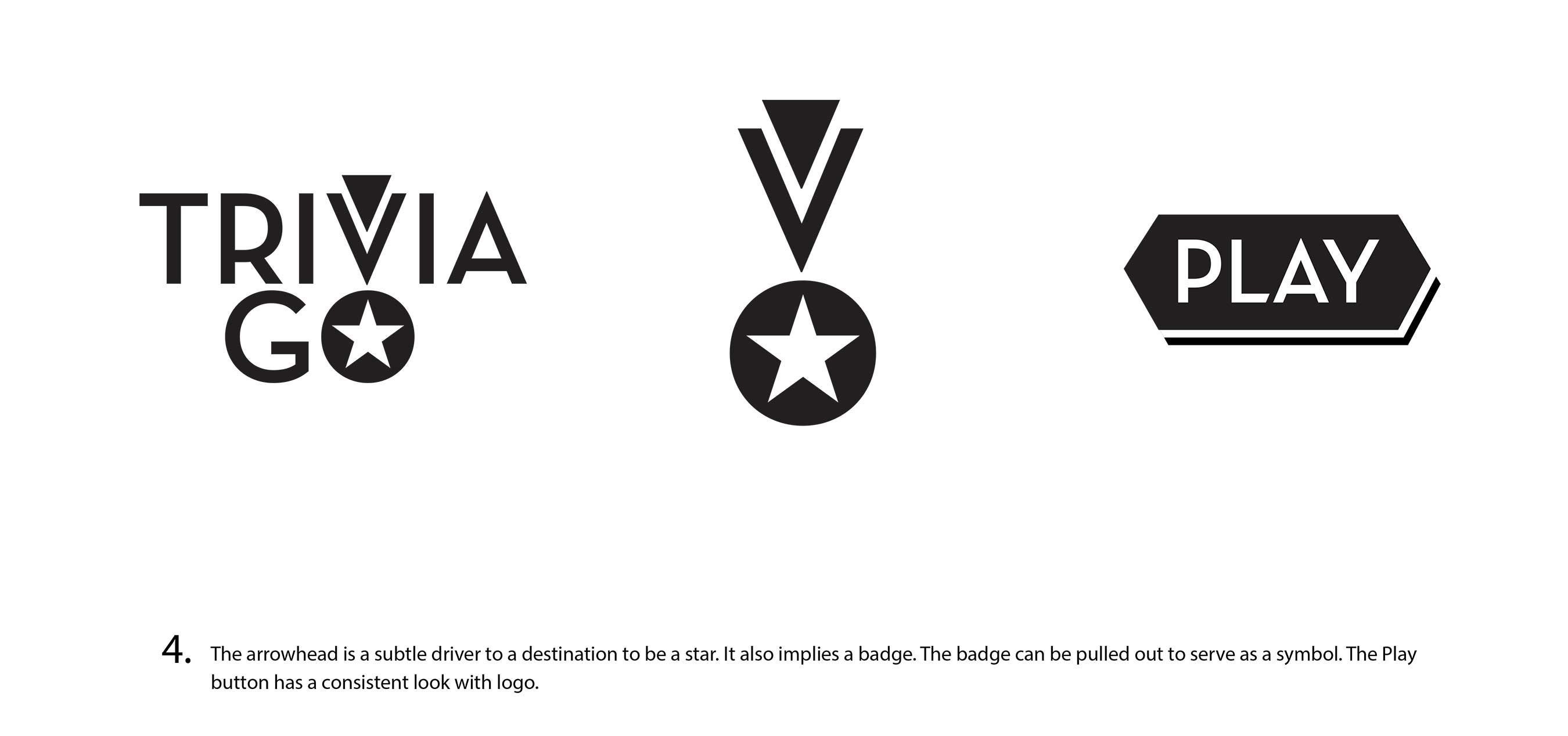
For Round 3, the client chose 3 directions they liked and wanted me to develop further. I presented the three directions with some variations, below.
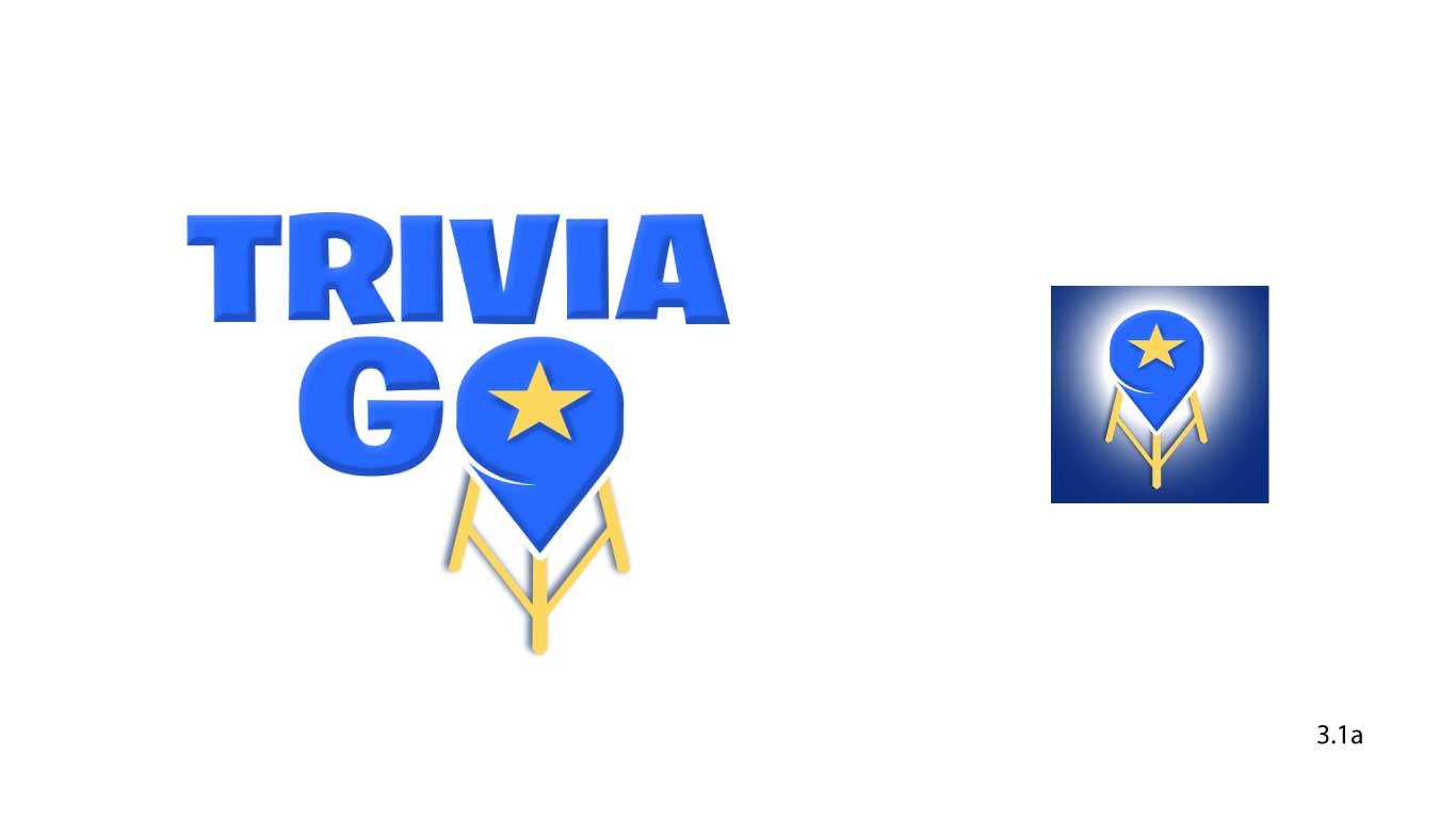
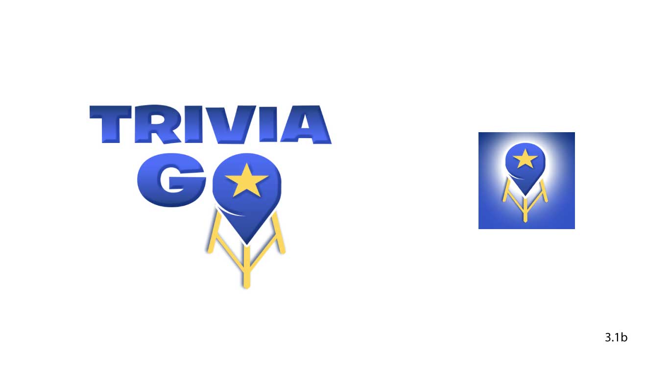
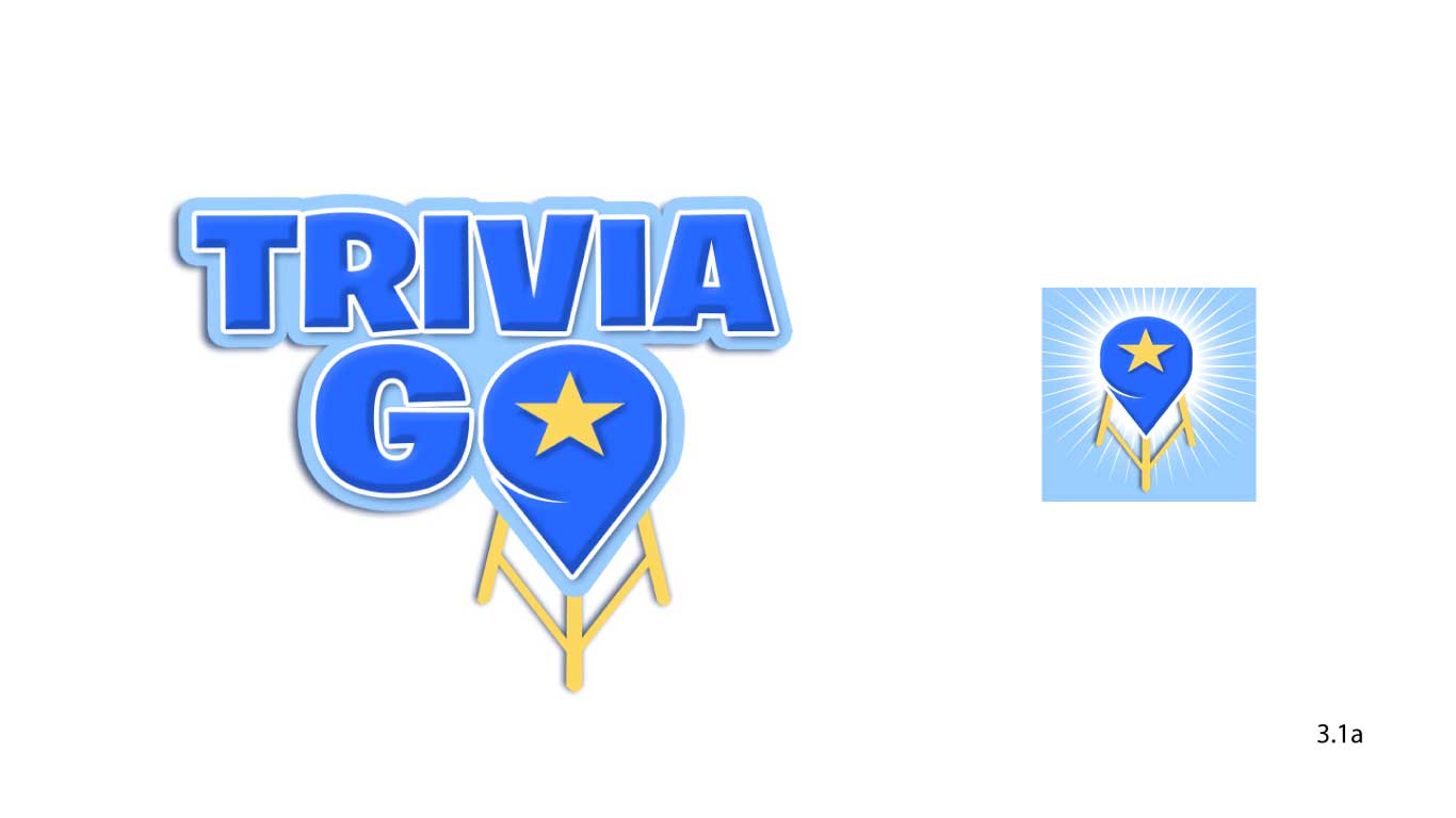
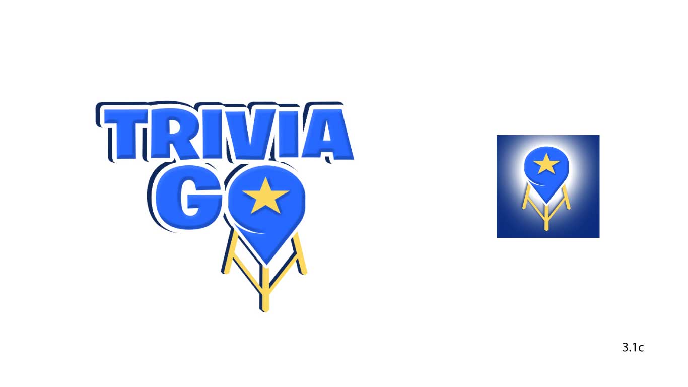
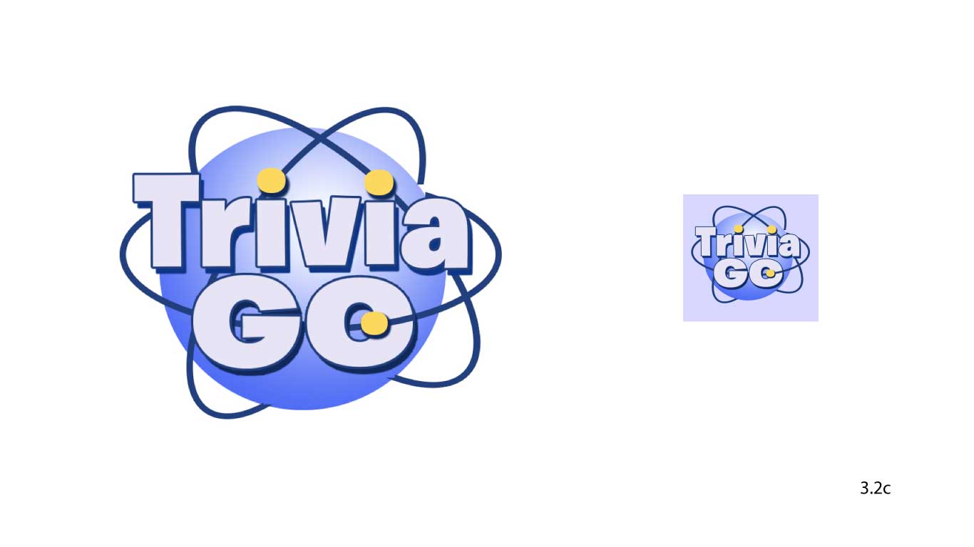
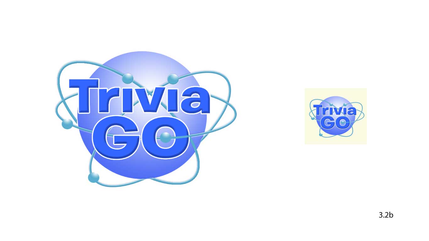
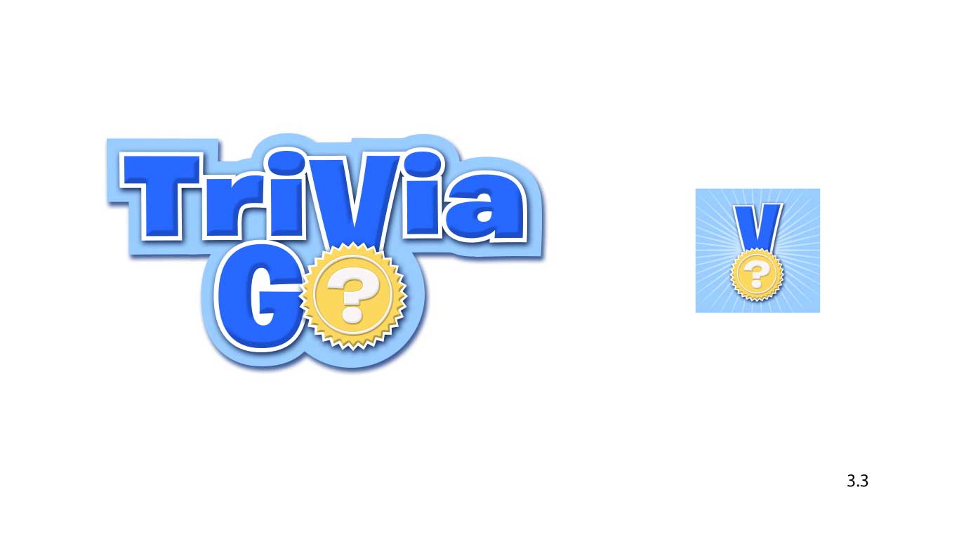
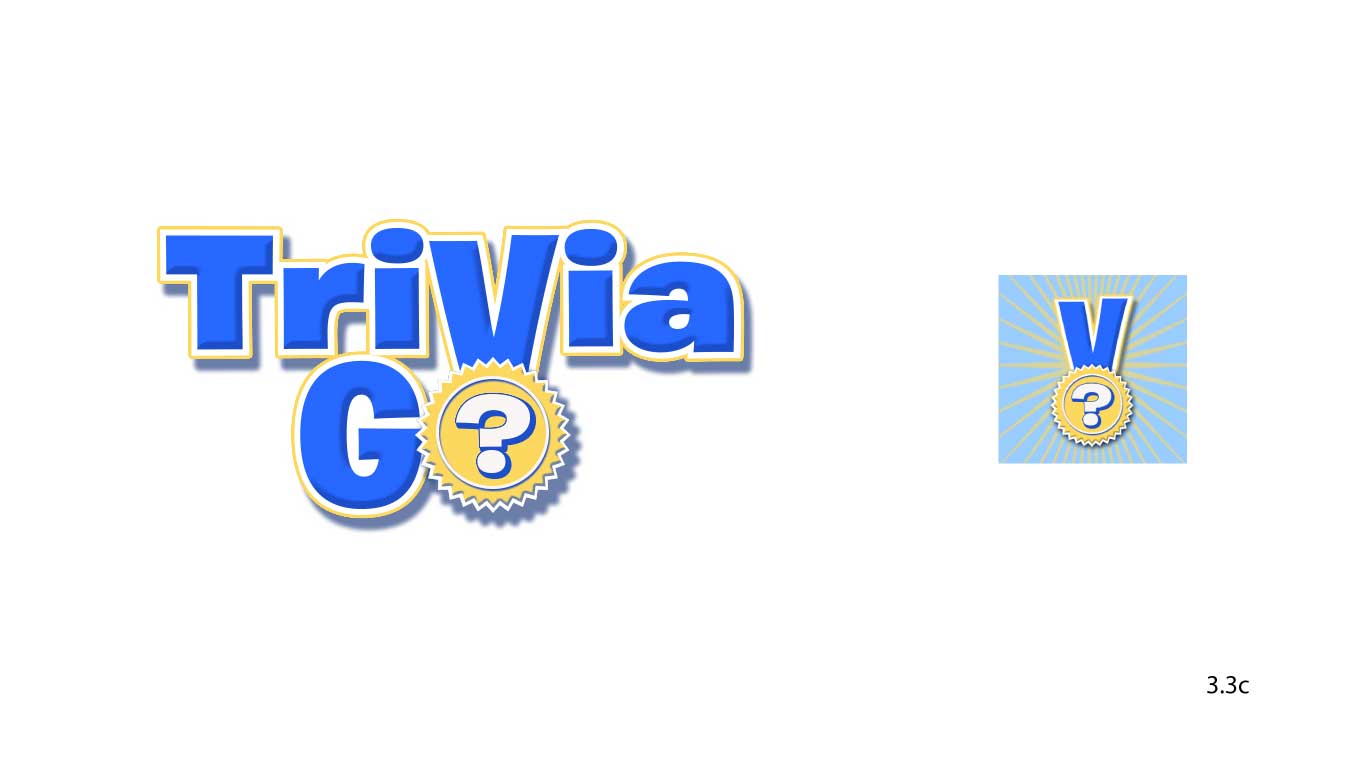
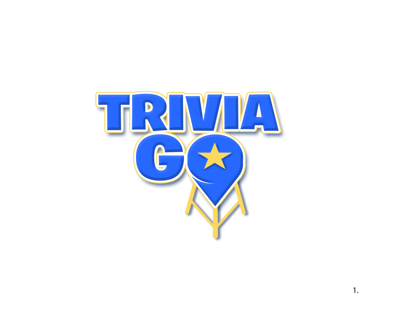
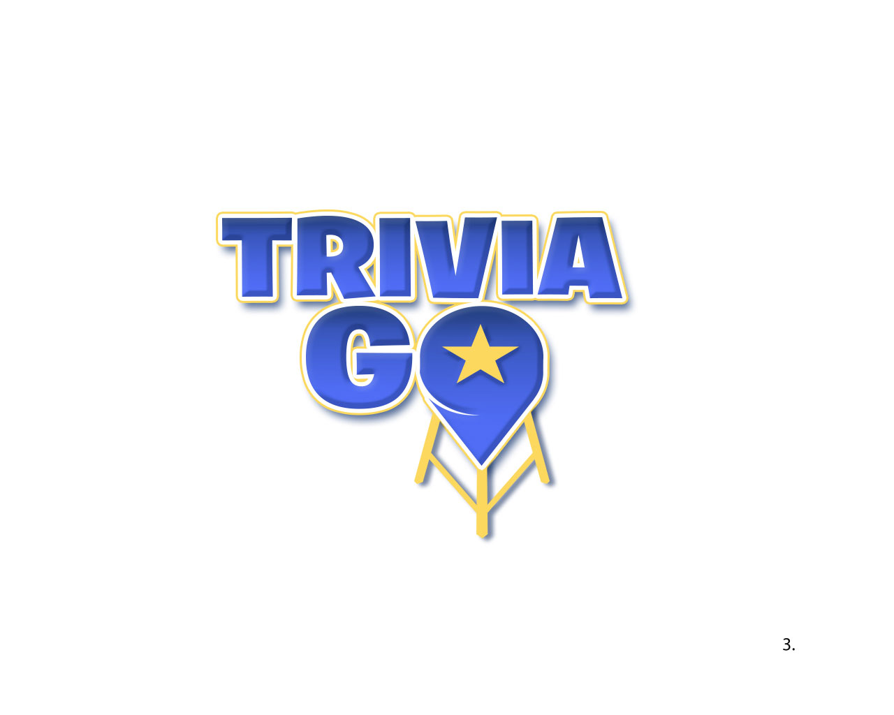
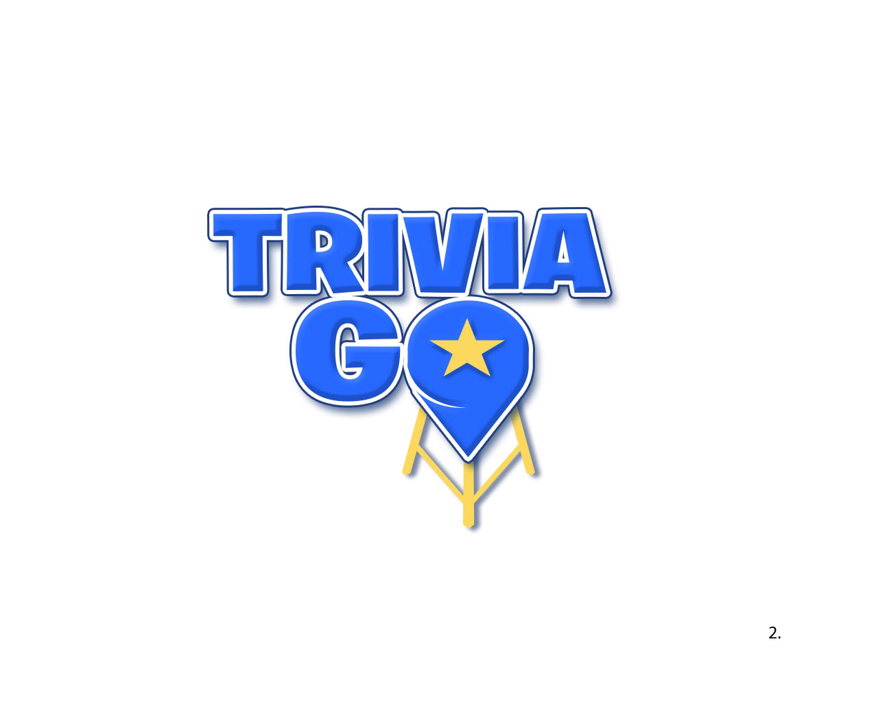
They picked the top direction, so I explored color variations.

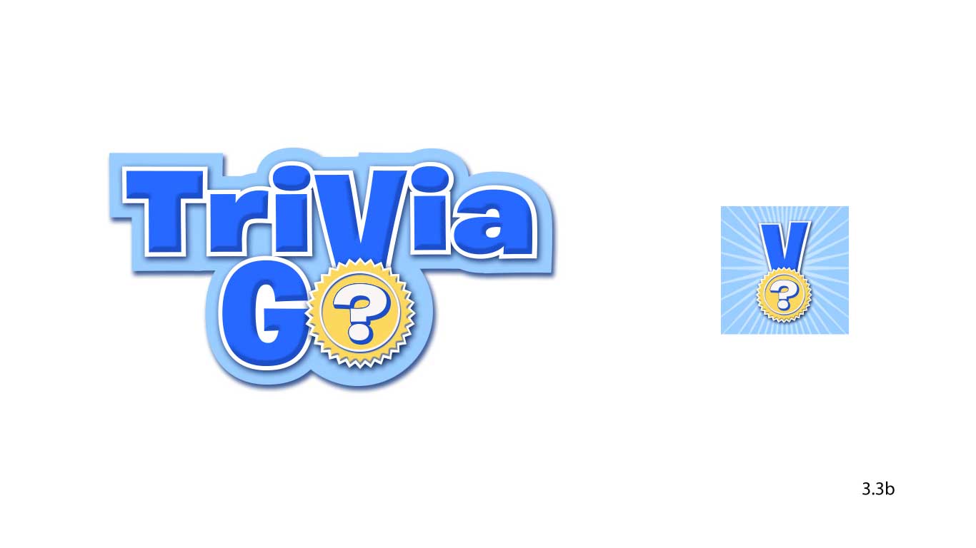
IOS icons were also explored.
Finally, we both decided that the word “Trivia” should be in upper and lower case.